New colour trends show that pastel colours and those evoking nature create a greater feeling of harmony and wellbeing in environments. This does not only promote the wellbeing of employees but also helps customers feel more comfortable.
Visili Kandinsky, pioneer of abstract art, already expressed this by mid of last century: “Colour is a power which directly influences the soul”. An ever growing idea when we discover that the visual impression generated by colour is directly related to emotions and behaviour, making crucial the choice of one colour over another when making key decisions such as which is the most appropriate to decorate an office.
Experts agree that spaces strategically designed depending on colour may help increase employees’ productivity and motivation. A recent study by Texas University published in Enterpreuner, revealed that grey, beige and white offices induced feelings of sadness and depression in women. Men, on the other hand experienced dark feelings against those which took purple and orange as basis for their decoration.
In this sense, it is vital to understand the properties of each colour-scheme to choose accordingly depending on their functionality and objective desired. Being aware of their features and effects we can create the most appropriate environment for each type of circumstance. In case of companies, choosing the appropriate colours can make a difference when attracting customers. If you make them feel comfortable they can form a good opinion of the company and its products even without seeing them or having heard of them before.
“We live surrounded by colours and whether we admit it or not, each one has its own properties which influence daily life and wellbeing of people. To study their meaning is to learn to see beyond appearances; to know their energetic nature and influence on human beings. It is to know possible combinations and energies resulting from them”, declare in Ofita.
Actual trends
As new studies on colour psychology are published, trends for their use evolve making necessary constant research on this issue. Within the colour range applied these days to offices at an international extent it is worth mentioning pastel colours and those evoking nature to offer a higher feeling of harmony and wellbeing. However deciding the most appropriate will depend on the type of company and the objective desired.

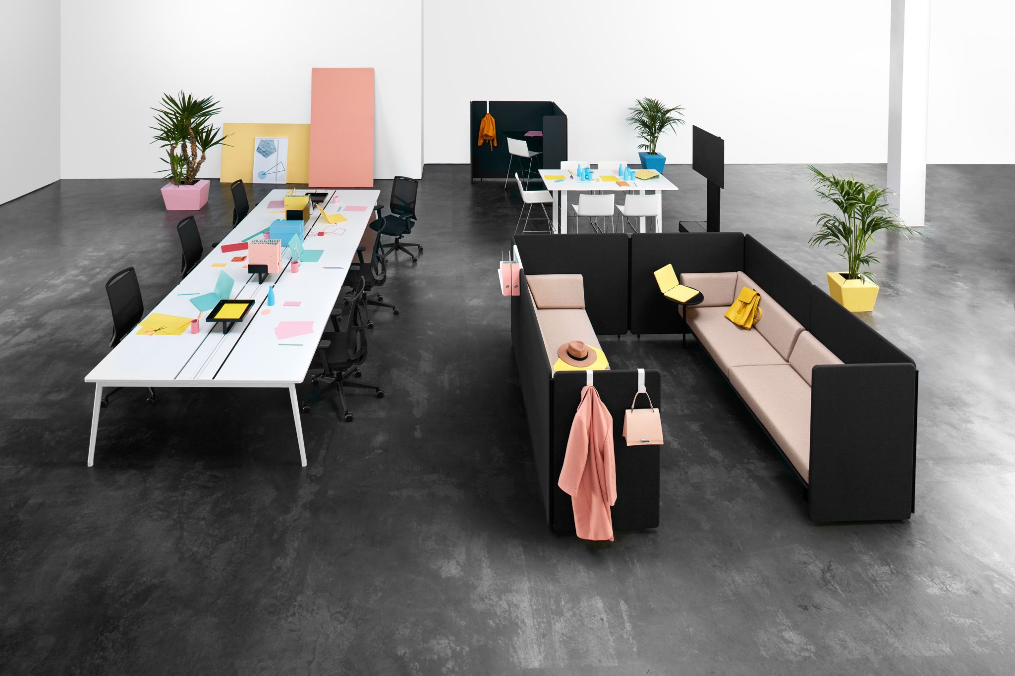
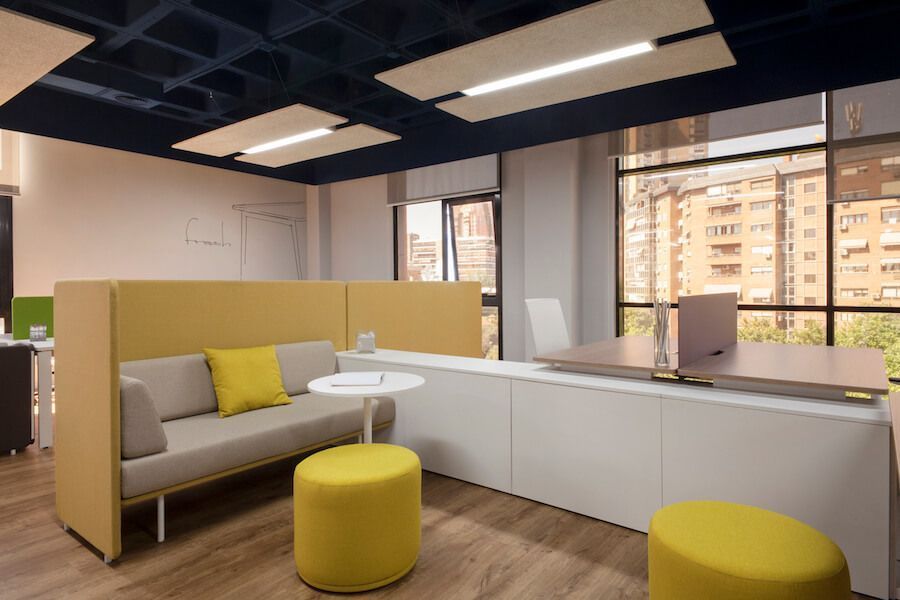
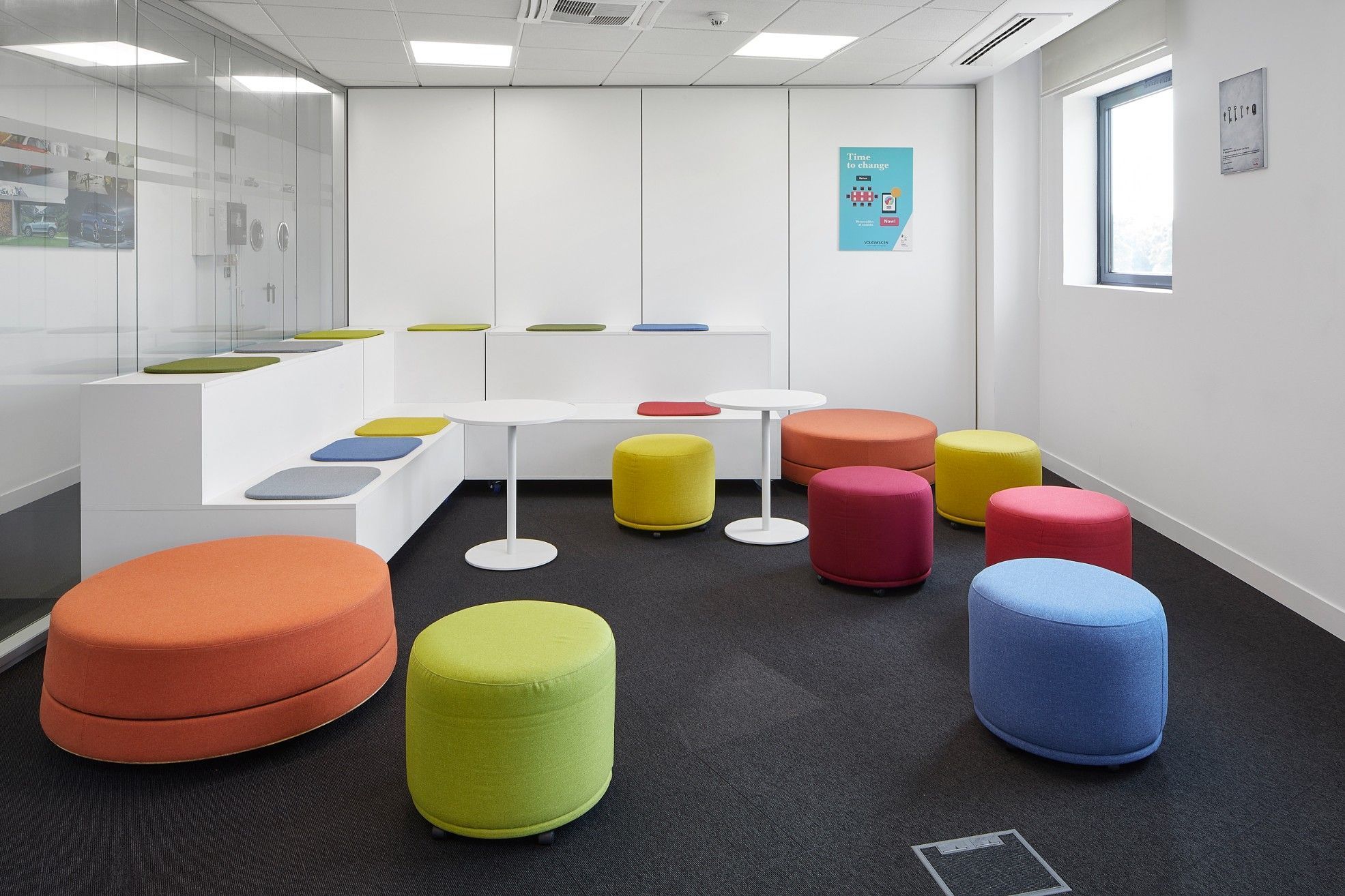
Pastel colours: Light and joy
Pastel colours are used to give a modern aspect and offer more light. Just as with blue and green, softer colours can be useful for hectic work environments requiring a relaxing atmosphere. The result is optimized when mixing them with plants achieving a nice, cosy and joyful environment.
Elizabeth Brown, director of EB Color Consulting in Seattle states in an article in Entrepreneur, that regardless of the palette chosen it is necessary not to create too much contrast between light walls, dark colours in furniture or decoration. “Too much contrast creates visual fatigue” she says. And then she adds: a black and lilac palette can be incongruous and cause visual fatigue; a beige and lilac combination on the contrary is more appealing.
Pastel lilac, violet or purple are recommended for small details to activate imagination and curiosity. They provide serenity and create soft and comfortable environments and they are also appropriate for upholstery and some elements of office furniture.
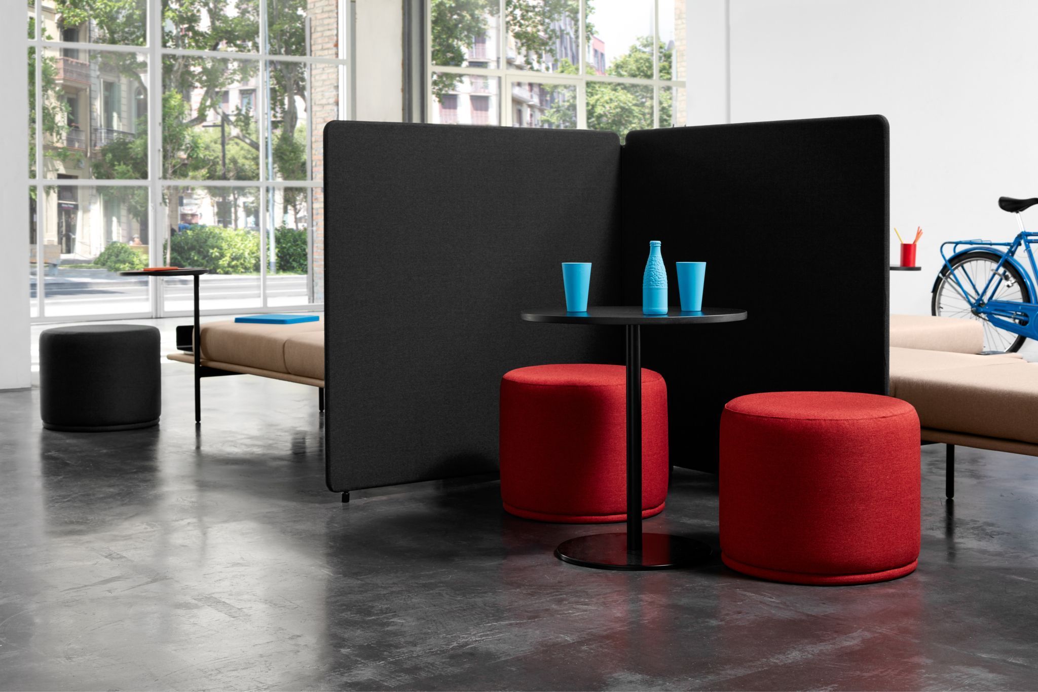
Red and orange: Energize atmosphere
Until not too long ago, red would have been unthinkable for work spaces. Today it is beginning to be applied in small doses either for furniture accessories or even illumination with the idea of setting new standards and creating energetic environments. This is also the case of orange. “We have found that having red lights is like drinking a cup of coffee, it provides a state of alert without eliminating melatonin. It is something new and people are starting to think in this type of solutions” declares Mariana Figueiro, Professor at the Lighting Research Center, in an article published in Market Watch.
It is also advised to use these colours in certain pieces of furniture to provide light but mainly in sets of chairs and not as the main colour. Using them locally create warm and attractive environments as they reinforce people’s personality and boost their energy. Chairs and sofas in this line break the monotonous aspect of a room decorated with “subdued” and cold colours.
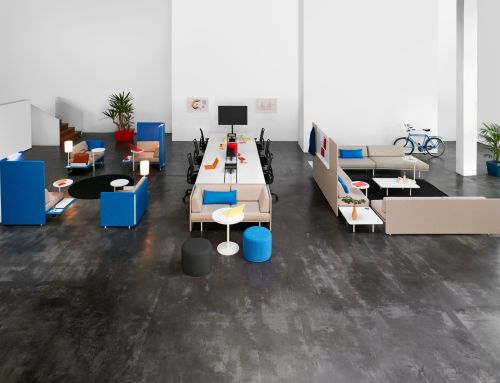
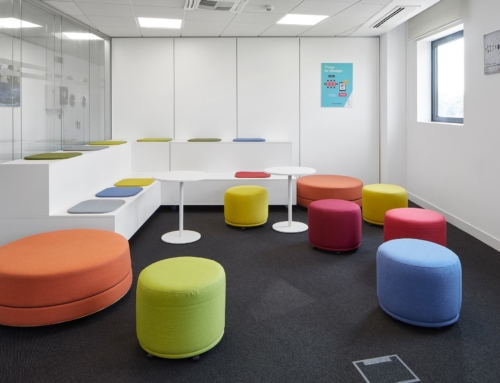
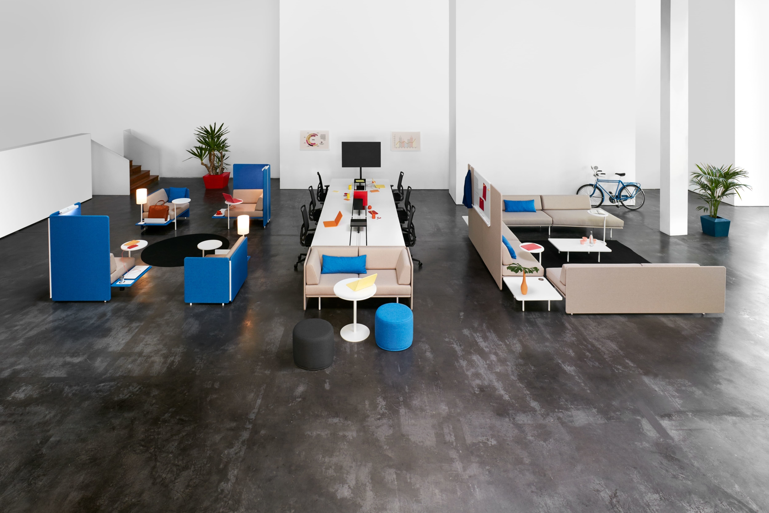
Bright colours: Promote collaboration
Shared spaces are becoming an ever growing trend as they offer professionals a series of competitive advantages: They encourage collaboration, creativity, exchange of ideas, creation of networks and socialization. In this sense, experts point out that in addition to thinking about their functionality and design, the challenge is to find the most appropriate colours, especially bearing in mind that they have to suit most employees and not only some of them.
Although there is no consensus, some experts propose that they have to be bright colours in line with the corporate colours of the brand to, therefore, promote a collaborative and energetic environment. “While bright colours normally help people generate ideas, those lighter ones such as green and blue help them relax”, says Linda Sharkey, Human Resources expert and co-author of the book ‘The Future-Proof Workplace’, in a note published at The New York Post.
Green: Evoking nature
In order to turn offices into nicer and more comfortable spaces for people, the actual trend is to incorporate greater number of natural elements with green, greenery and earth colours as main actors; in addition to wood as main material. This fashion has its own name: Biophilic design, focused on inserting aspects of the environment both in architecture and in decoration.
Natural light, furniture made or recycled materials, gardens, views to the outside and open air spaces to take a break are some of the new resources companies who wish to give priority to nature in their work spaces are betting on, says an article published in El País.
This same journal mentions the Interface report stating that wellbeing and productivity levels are 13% higher in those environments incorporating nature to their spaces.
Green is the most representative colour of this trend as it evokes nature by itself. Its advantage is its versatility because it allows a great number of variations. Although its basic shade may seem excessive, it is perfect to decorate work spaces as it boosts performance and activity of people. But it is not recommended to paint walls in green. The idea is to choose it for details or certain pieces of the environment.
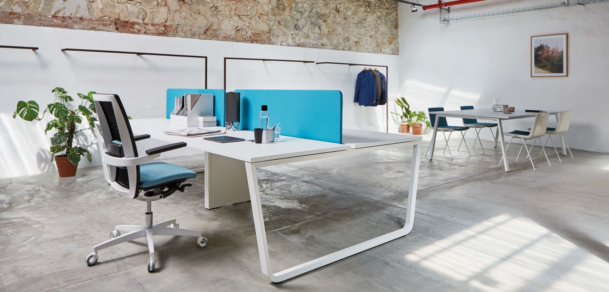
Blue: Reduces tensions
Recent investigations have discovered than saturated blues and cyan are perfect to increase the level of alert of employees, especially in the case of those working in night shifts. Lighter blues moreover provide a relaxing effect in hectic work spaces. In today’s world, both can be necessary to be incorporated to offices regardless of the purpose desired.
Blue provides spaciousness and eliminates physical spaces. It is a colour that provides peace, reduces tensions and generates positive vibrations on people who work surrounded by it. Moreover, everyone likes blue. It is ideal to be applied to office furniture; it tremendously intensifies white, cream, grey or beige walls and combines with other stronger tones such as orange or yellow. It is recommended for sets of chairs and also for different furniture elements: drawers, cabinets, tables, legs of tables, etc.


