Color in the office, perhaps more than any other design element, is crucial in defining a space. Choosing them correctly can help increase employee productivity and motivation, as well as promote better corporate branding.
The fact that color in the office has a clear physical and emotional impact on people makes it advisable to use it consciously to facilitate different activities.
Color in the office, a matter of balance
For example, recent studies have shown that totally gray, beige or white offices negatively affect the psychological state of women, while spaces in which purple and orange predominate generate gloomy feelings in men.
In this context, it is crucial to understand what each color contributes to choose it according to the desired objective and the functionality of each space. The goal is to achieve a proper color balance.
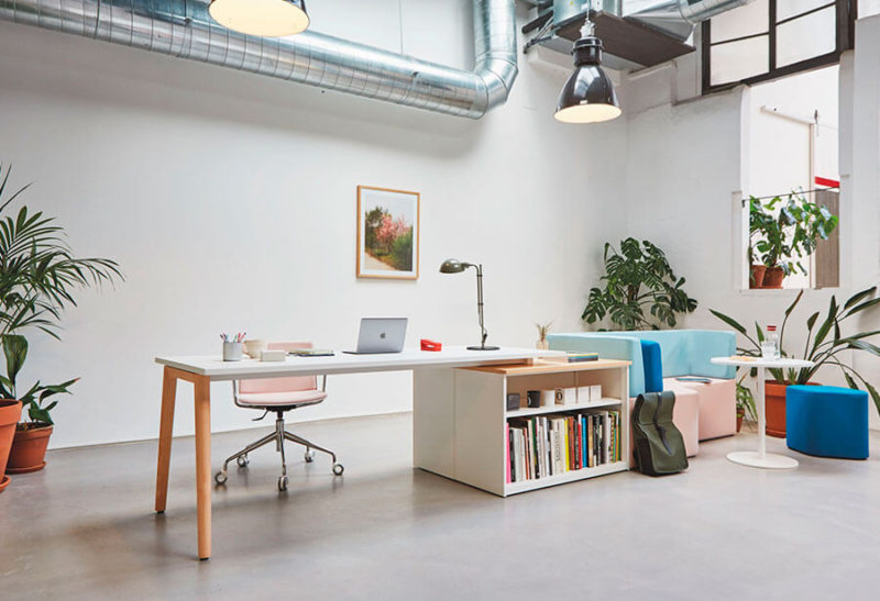
What color is more suitable for an office?
As new studies on the psychology of color emerge, trends in use evolve. Today in the interior of the offices pastel colors and tones that evoke nature have a lot of prominence, since they help us in the objective of creating increasingly pleasant and comfortable offices.
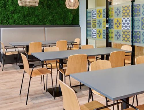
Brown and beige tones have relaxing effects. Therefore, they fit very well in informal spaces or / and in those more social, where you can take a break and have a coffee.
Neutral colors in the office
When it comes to choosing color in the office, as a general rule people choose to paint with a base of neutral colors, such as white, light blue and light gray, to which a touch of color is added. However, that touch is not enough to create a pleasant atmosphere. The important thing is a design that uses color intentionally, and to consider all the elements of the office interior, from the walls to the furniture.
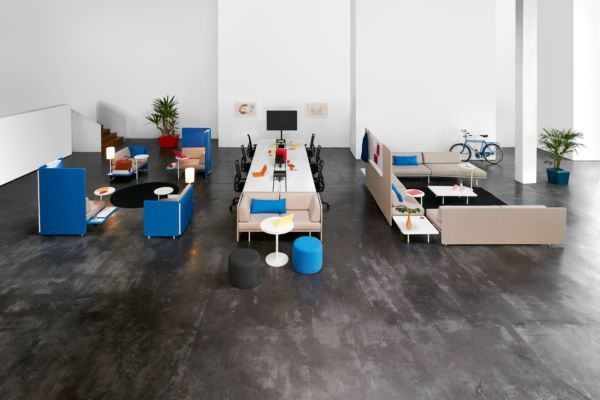
On many occasions, it is the excess of color, and not its absence, that negatively impacts the well-being of employees. This bad choice, on many occasions, is due to a wrong interpretation of how the office can be the showcase of a corporate brand.
A tip to improve the color in the office: neutral tones fit together. They are a perfect base to introduce colors and not saturate an environment.
White, the color for a bright office
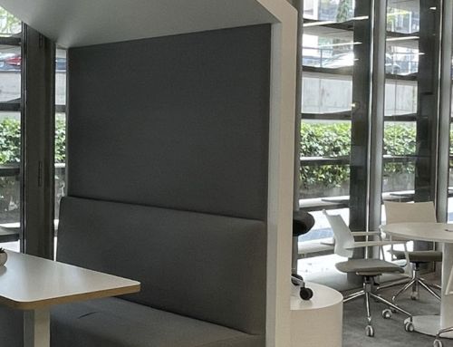
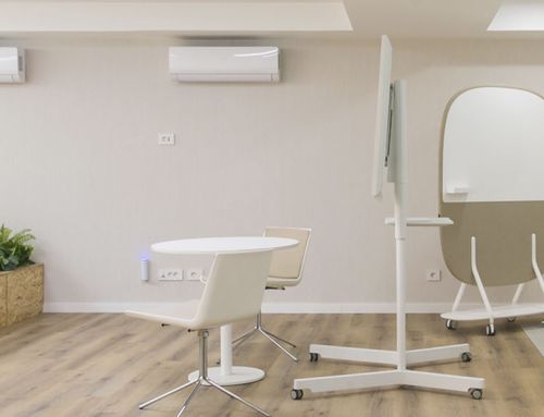
Painting in white is always a success. It is the perfect color to create a neutral and luminous base. It captures the outside light and multiplies it because it reflects it (up to 90%). Bright rooms feel more spacious and comfortable. White helps concentration and also gives an appearance of cleanliness and general order.
Pastel colors also give us a greater sensation of luminosity. The result is optimized by mixing them with plants, achieving a cozy and cheerful atmosphere. Lilac, violet, or pastel purple are recommendable for small details to activate imagination and curiosity.

Warm colors stimulate and bring luminosity
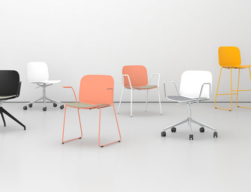
Warm colors, made up of red, yellow and their combinations, stimulate us. Red is implemented in small doses, whether in accessories, furniture or even lighting, with the idea of breaking the schemes and creating environments that provide energy to workers. The same goes for orange. It is advisable to use these colors in certain pieces of furniture to provide luminosity, but not as the main tone. Used locally – for example, in informal spaces or welcoming areas – they create very pleasant and colorful spaces. Orange encourages interaction with others in a more informal way.
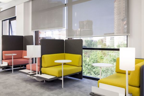
Cold colors in the face of stress
Green is a cool color; it represents nature, growth and hope. It has a relaxing effect and favors concentration. Therefore, it is suitable for individual workstations, gathering spaces and training areas.
Blue – especially in its more subdued tones – represents tranquility, with a calming effect on people. It is the ideal color for environments and workplaces with a high level of stress.
On the other hand, saturated blues or cyan are perfect to increase the alertness of workers, especially in the case of those who work night shifts.
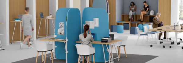
Blue creates a feeling of spaciousness and elimination of physical spaces. In addition, it is to everyone’s liking. It is ideal for office furniture. It brightens up white, cream, gray or beige walls exceptionally and blends well with stronger shades such as orange or yellow.
Each person has their own preferences, but in general, we all perceive a physical reaction to the sensation that a color produces, such as cold in a blue room or hot in another painted red. For most people they are common reactions.

